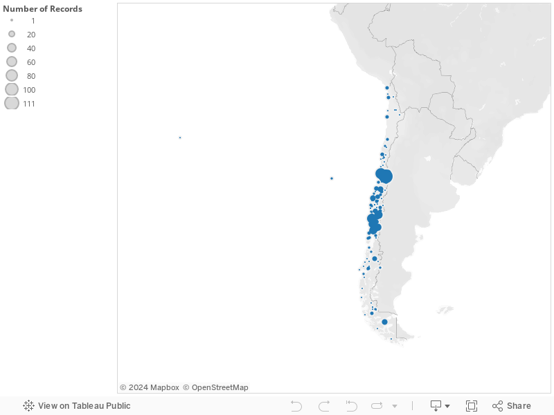
Last semester I worked with En Viaje, a Chilean travel magazine published by the National Railway Company (Empresa de Ferrocarriles del Estado, EFE) between 1933 and 1973. I did not work with all of them, I examined the issues until 1946. The editors of this publication set off to depict the south of Chile as a tourist destination. The North was the productive landscape with its mines and its valleys. The South was the landscape to be admired. Among other things, I recollected the amount of times specific places appeared in the cover, the editor’s note, the articles, and the insert. Then I georeferenced that data using Tableau, a free data visualization tool. The result was this:
For some weird reason I cannot still figure out, you cannot see it properly. You still see it in my profile at Tableau here.