The Boston College Libraries are committed to using data to better understand how members of the BC community use the libraries’ services, spaces, and collections and to make informed decisions. While we have long collected data, more recently we have started to use this data to create interactive dashboards that visualize this information in new ways and allow users to explore our data. These dashboards allow library staff to better understand the data that we have collected, but they also given patrons an insight into the work that we do. To this end, we have made several dashboards publicly available on our new Tableau Public profile.
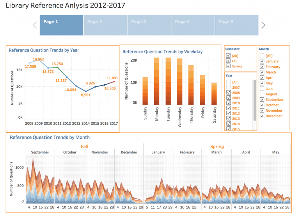
Currently, these visualizations cover library instruction data, information about questions at our reference desks, and visualizations on how spaces are used at both O’Neill Library and the Social Work Library.

We plan to update these as data is collected and add additional dashboards and visualizations to our profile in the future, so check back later to see what we are up to! We’ll also be displaying some of the visualizations on the screens in O’Neill Library, so be sure to take a look next time you stop by.
If you are interested in learning how to create data visualizations with Tableau yourself or would like to integrate Tableau into an assignment for one of your courses, please feel free to contact Data and Visualization Librarian Allison Xu (yaqing.xu@bc.edu) or attend one of our upcoming Tableau trainings:
An Introduction to Visualizing Data with Tableau
February 21, 2018, 3-4:30 pm.
O’Neill Library, Digital Studio, Room 205
In this workshop, participants will get an introductory, hands-on learning experience of Tableau. The workshop will be focused on Tableau key functions, including:
- How to connect to data sources
- How to create visuals and assemble them into a dashboard
- How to publish the dashboard to the Tableau Public server
This event is free and open to the public, but we kindly request that you register.
Mapping with Tableau
February 27, 2018, 3-4:30 pm.
O’Neill Library, Digital Studio, Room 205
Mapping data is one of the many ways Tableau helps people see the information in relevant, insightful ways to make better decisions. In this workshop, participants will learn how to analyze their data geographically, how to plot the data on a map in Tableau, and what types of maps can be created in Tableau.
This event is free and open to the public, but we kindly request that you register.
Thank you for writing this post!
You’ve the most impressive websites.
Hmm it appears like your website ate my first comment (it was extremely long) so I guess I’ll just sum it up what I wrote and say, I’m thoroughly enjoying your blog. I too am an aspiring blog writer but I’m still new to the whole thing. Do you have any points for first-time blog writers? I’d definitely appreciate it.
Heya! I just wanted to ask if you ever have any trouble with hackers? My last blog (wordpress) was hacked and I ended up losing months of hard work due to no backup. Do you have any methods to stop hackers?
I am not certain where you’re getting your information, however good topic. I must spend some time learning more or working out more. Thanks for wonderful information I was looking for this information for my mission.
150cm ラブドール この問題について知ることは確かにたくさんあります。私はあなたが言ったすべての点が好きです。